Virtual Art Exhibition
We are very proud to Exhibit these talented, young Artists' work. We recognise the impact of these unprecedented times and we are in awe of their resilience, determination and focus on achieving their goals. Their Personal Investigations are exciting, meaningful and purposeful. We are eager to see how this unit of work will unfold and to see what they produce in the near future. For now, we invite you to take a moment to enjoy their outcomes so far.

LEWIS NASH
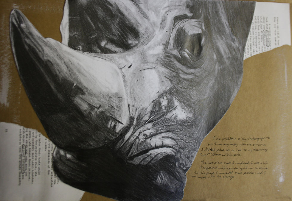
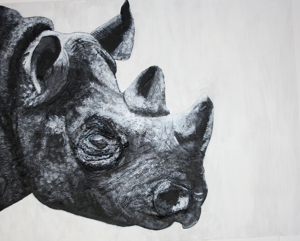
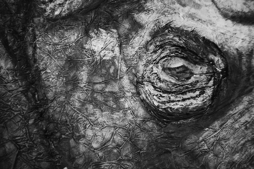
Sudan
It is named in honour of the last ever Male Northern White Rhino who lived his final years behind military protection alongside two females, who are the only ones remaining of the species, making them now classed as extinct. The piece was made using Tissue Paper and Acrylic Paint on MDF. Using tissue paper allowed me to mimic the texture of the rhinos skin and to give the piece a 3-Dimensional look. The piece was inspired by the artist Tom Middleton who is known for his stunning animal portraits.
My project as a whole is exploring the idea of Extinction and how not only are we causing these animal’s extinction we are also putting our own existence at risk. So far I have explored the beauty of these critically endangered animals and I am now venturing into how we are causing their extinction and the damages we have caused to the wilderness.
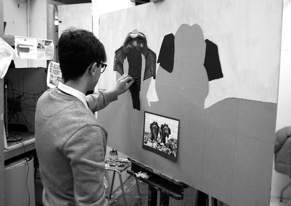
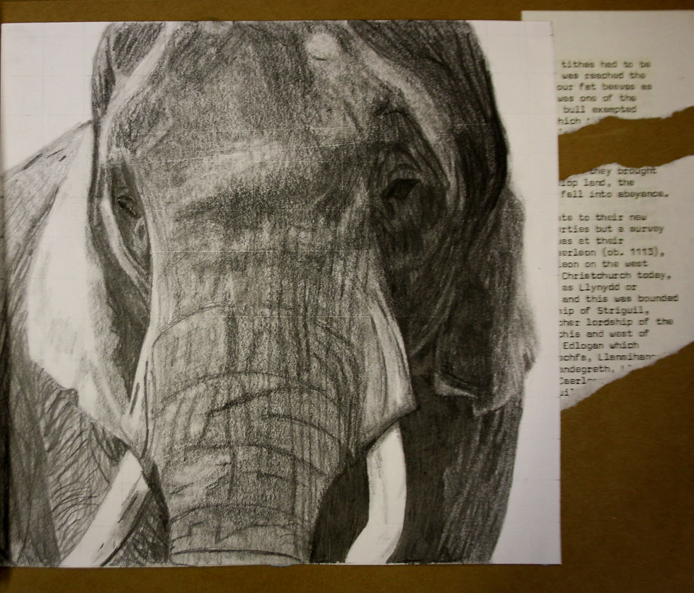
Mshale
This piece is named after a very brave African Elephant who managed to survive FOUR poaching attempts. Each attempt was a poison dart attack in which he was able to recover from. The rangers named him Mshale as in Swahili it means “Arrow” which is appropriate for the trauma he endured. In the wild the lifespan of an elephant has dropped significantly as a result of poaching. Their lifespan can reach up to 70 years of age but in these circumstances the average life expectancy has dropped down to 56. The piece was done using tonal pencils on cartridge paper and was inspired by Tom Middleton and Henry Moore where there is a lose sort of style on the trunk.

HASHENE MADIPOLA
Isolation
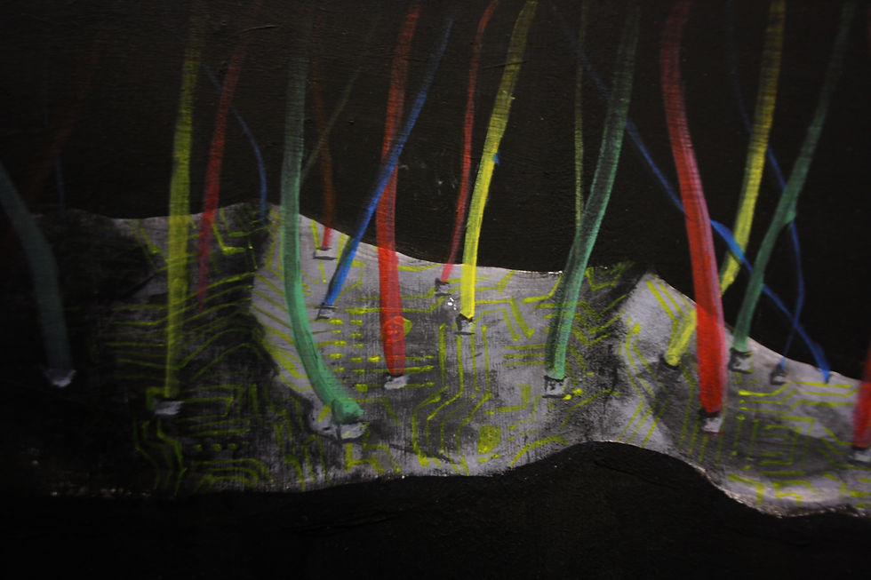
In an age where human interactions are done through a screen, one can feel isolated without the wires of social connection keeping them as one. Even when suspended in darkness, alone physically and mentally, the wires that keep us whole are attributed to the presence of human interaction virtually. The lockdown emphasised this human characteristic as the world depended on their screens to contact any other person.
Purity
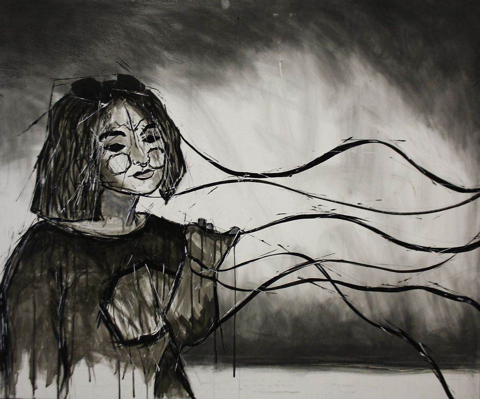
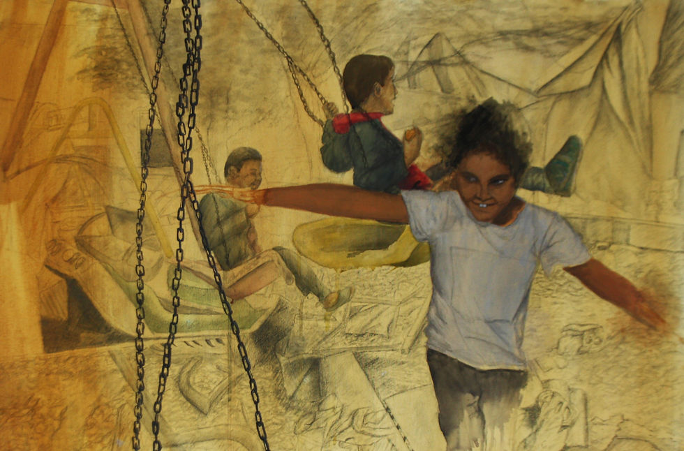
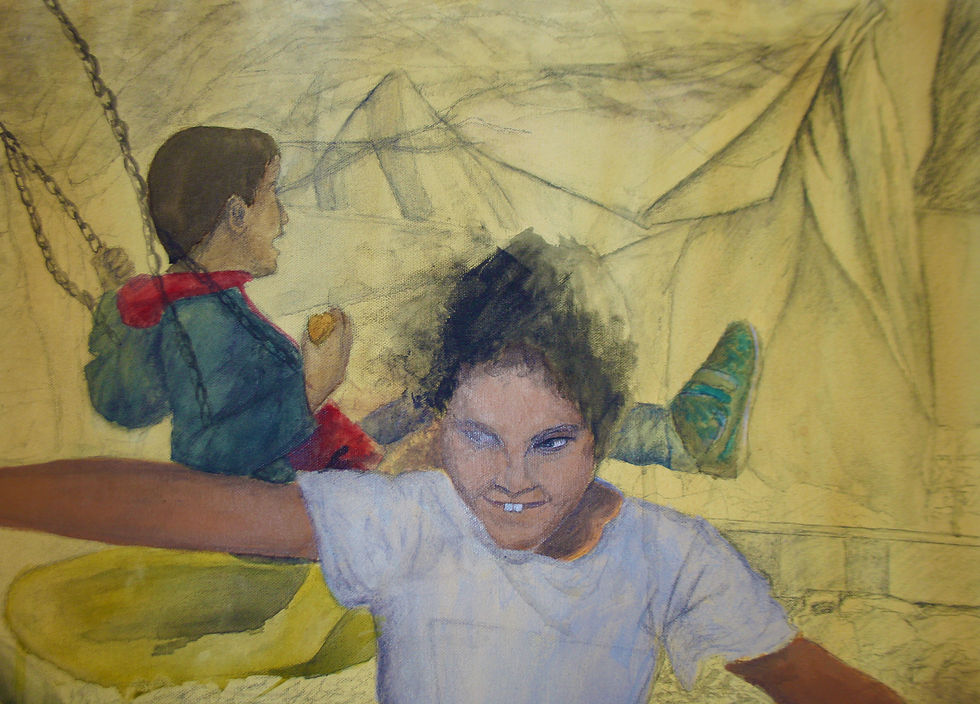
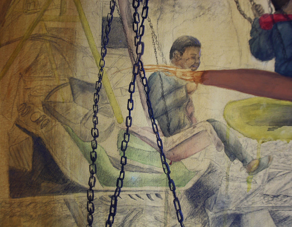
Children are the neglected victims of war, cast aside and forgotten about by the veins of corruption that run deep into the roots of government. A child’s heart is pure, and the vision of hope for the future is seen through the lens of a child. The destruction of terrain is neglected, and the absence of guardians are overshadowed by children playing with what is left from a war they aren’t fighting.


CASEY CHILDREN-SMITH
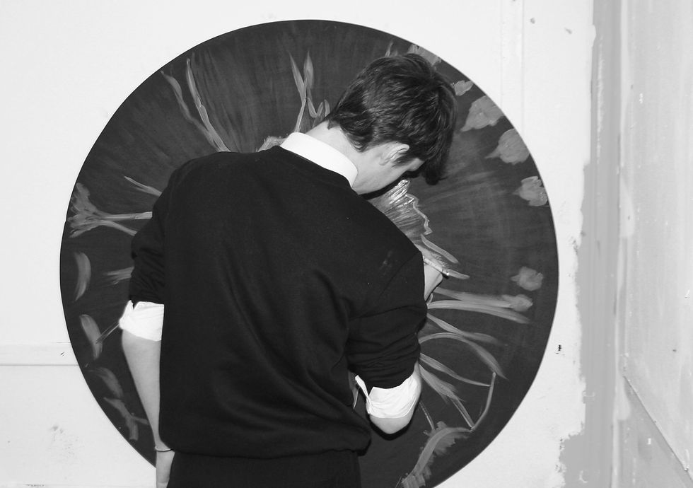
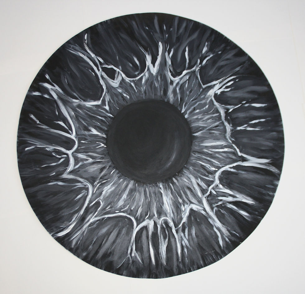
Achromatopsia
The piece features the visual representation of a form of colour-blindness called achromatopsia – it is characterised by a partial or total absence of colour.
The main aim of my project is to explore colour and those affected by colour-blindness, thus for my first of my final outcomes, I decided to immediately explore the absence of colour – this leads to the result of this final piece: exploring the vision of an individual with achromatopsia and to help visualise others of a world with no colour.
I look to a range of artists who have been affected by eye conditions such as Georges Seurat who pioneered pointillism and chromoluminarism in a wave of neo-impressionism; and Yayoi Kusama who used a great range of vibrantly coloured dots in sculptures, exhibition spaces and paintings – expressing the effect of a mental condition she is, allowing her to not feel secluded through the sharing of experiences through her artwork.
The work is done on a circular board of MDF using acrylic paints. The board itself was to cut to be a circle in order to represent the shape of the iris, as I wanted to explore more of the structure of the eye and include elements of it into the painting.
The board is approx. 120cm in diameter. This size was chosen due to how I want to incorporate it into my exhibition space – I want the different eyes to be on the walls and ceilings to create an effect of a different view on every wall you look to. I also wanted to create the experience of everyone looking to you and/ or being intrigued by you. From personal experience with being colour blind, not matter how old I am I have always received a vast range of questions concerning my colour-blindness whenever I tell someone of it – by having eyes staring at you in my exhibition space, I hope to recreate this feeling of being examined.
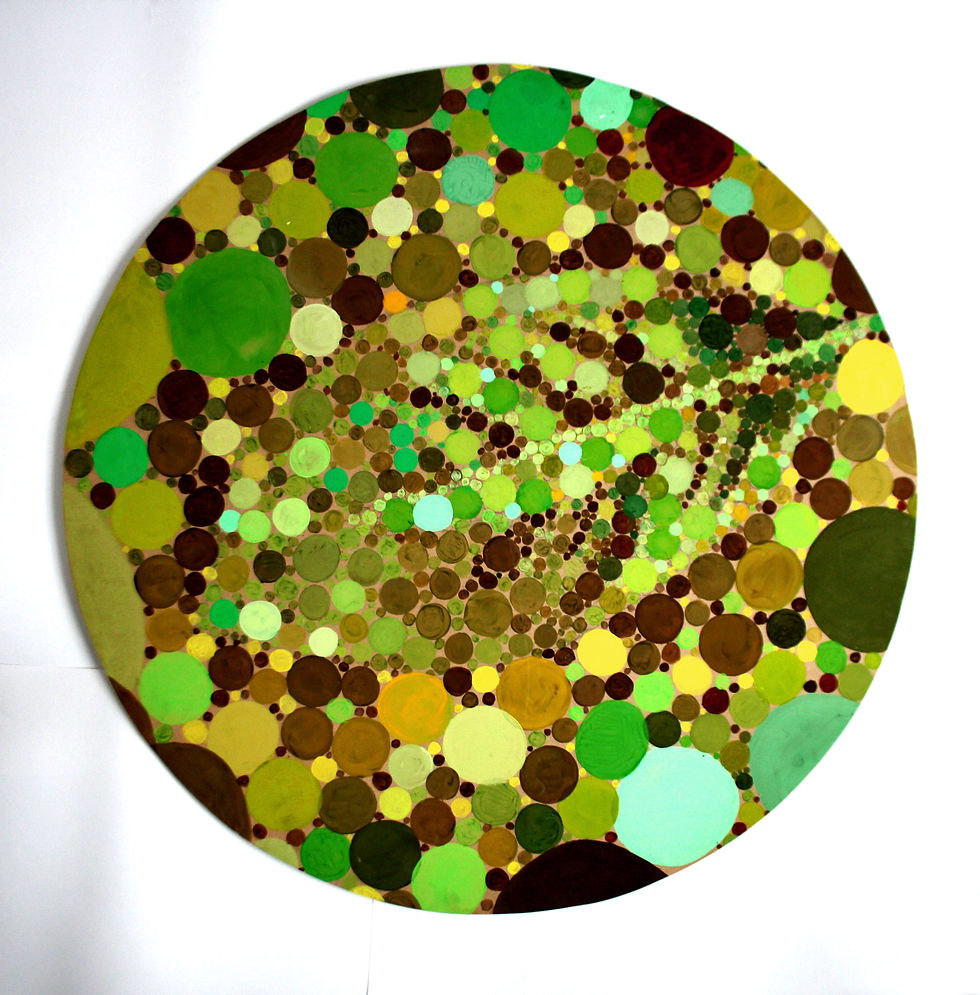
Tritonopia
The piece features the visual representation of a form of colour-blindness called tritanopia – it is characterised by the lack of ability to differentiate blue and yellow colours.
The main aim of my project is to explore colour and those affected by colour-blindness, thus for the second of my final outcomes, I decided to immediately explore a rarer, and more visually interesting form of colour-blindness. Thus I painted with colours following the spectrum of tritanopia.
I look to a range of artists who have been affected by eye conditions such as Georges Seurat who pioneered pointillism and chromoluminarism in a wave of neo-impressionism; and Yayoi Kusama who used a great range of vibrantly coloured dots in sculptures, exhibition spaces and paintings – expressing the effect of a mental condition she is, allowing her to not feel secluded through the sharing of experiences through her artwork.
The work is done on a circular board of MDF using acrylic paints. The board itself was to cut to be a circle in order to represent the shape of the iris, as I wanted to explore more of the structure of the eye and include elements of it into the painting.
The board is approx. 120cm in diameter. This size was chosen due to how I want to incorporate it into my exhibition space – I want the different eyes to be on the walls and ceilings to create an effect of a different view on every wall you look to. I also wanted to create the experience of everyone looking to you and/ or being intrigued by you. From personal experience with being colour blind, not matter how old I am I have always received a vast range of questions concerning my colour-blindness whenever I tell someone of it – by having eyes staring at you in my exhibition space, I hope to recreate this feeling of being examined.

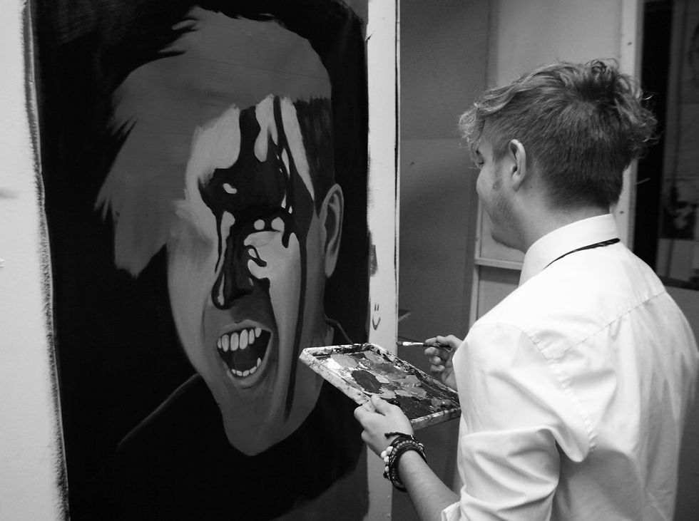
JIM HIGGINS
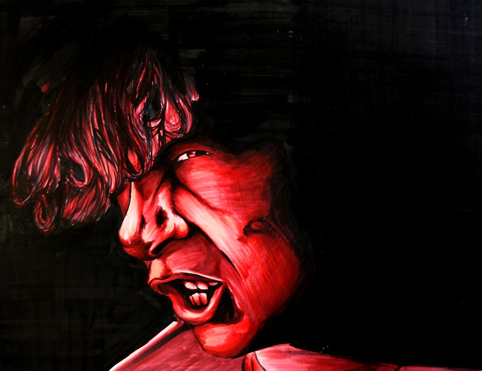
RED:
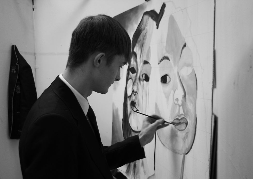
In this work I was hoping to create an eerie vibe(this piece will end up in a dark setting so should look like a red face emerging from a black wall) through using a reference with a very ‘confusing’ expression - from the empty, potentially angry, potentially sad expression I think this aim is achieved. The inspiration for the reference itself, ie. me being covered in blood, came from a music video I saw and I quite liked the idea of creating something very visceral and intense to stir a feeling of unease for whoever sees it - this helps for my installation since the plan is to create a space where those who enter feel very exposed and maybe even scared, but reach a catharsis by the end via shouting into a microphone and/or writing onto the wall itself.
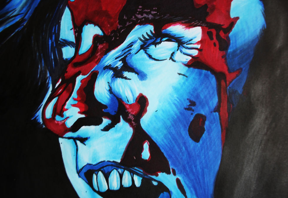
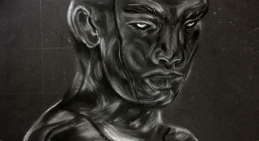
VENOM:
This is far more graphic than the red painting on linen but using the same set of photos - the idea is to create much the same feeling from the piece but to also display some diversity in my choice of media(marker) and to display my technique with this media. This particular imagery is probably more striking than the previous due to the far more intense expression and contrast between the blue face and the blood, and I quite like that as it is in many ways reflective of me and my ways of venting negative emotion.
PURGE:
This piece is far more focused on demonstrating my biro technique - something I’ve been working on for a long time now, and that I believe has improved drastically in the last year or so. I had a lot of fun with facial features as per usual but I was proud mostly of the way I was able to create convincing cast shadows and hair since his hairstyle and type is not easy to draw, especially with biro. Much like the blue one, this is a display of emotion with very negative connotations but just a little less personal and more to do with the technical aspect of my drawing.


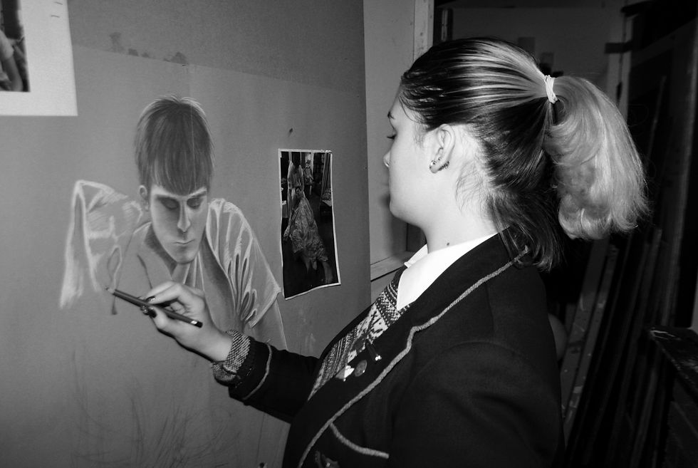
CHLOE MULLIN
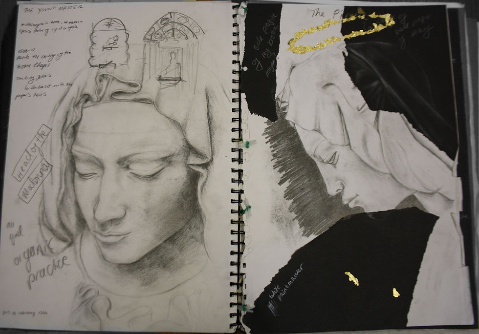
The double page spread of the head of the madonna:
A drawing study of a close up of the head of the Madonna (the Virgin Mary) of the Pieta by Michelangelo. These detailed drawings were for working out composition and medium ideas and studying the subject through drawing for a larger inspired piece, whilst sharpening my skills. Drawn in graphite stick pencil.
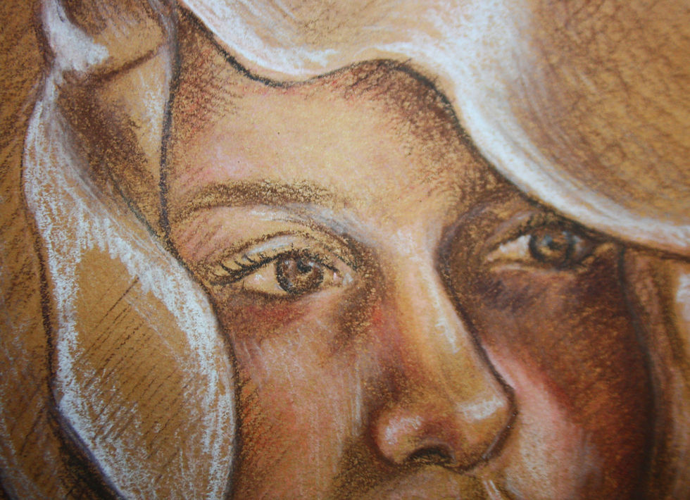
The self portrait with a hood:
A self portrait, especially for mimicking the ruffles hand carved by Michelangelo. Taking the photo used for reference included hanging a lab coat and other fabrics over my head. Since it had the thickest material, it hung in the best way and produced the folds and creases I wanted a chance to draw. I used a cross hatching shading method to simplify areas, but to still indicate them well.
I drew this in chalk pastel pencil on brown paper. The brown paper was a great medium shade to work with, allowing me to mark the lightest and darkest areas when I started the drawing and build it up from there.


ABINA NURSE
Purple piece
Titled- Unknown
I was inspired by at Elly Smallwood and her use of detailing while painting skin tone as she adds a variety of colour and tone to the face. I titled the piece unknown as Smallwood’s work is usually unfinished, with charcoal sketches marks visible through the paint, therefore I drew from this idea and decided to name my piece unknown, so it has an incomplete feel to it. A large canvas stood out to me to paint on as it was scribbled with sharpie, and this tied in with my theme of imperfection and roughness – as the canvas is already flawed, but I was still able to paint something beautiful over it.
Oil painting
Titled- Headlights
This is a more personal angle, allowing more detail to be added to the face. I enjoyed working on a larger scale as all the features are much clearer. Though it cant be seen there are flashing lights in the background of the image, therefore I called the portrait headlights, however I wanted to focus on the face itself as the artist I was inspired by, Elly Smallwood is an emotive portrait painter.


JJ
La diosa plata
This acrylic portrait features a subject surrounded by words from an interview I did with the subject about freedom, expression, appearance and judgements. The face takes inspiration from street artist Rone who makes works in derelict buildings, often where women have been attacked or wouldn’t feel safe. Hence, my work is centred around problems like women feeing unsafe (due to things like catcalling) the ability to express oneself through appearance (piercings, hair dye, tattoos, clothes etc) without judgement and overall the lack of encouragement in today’s society for individuality rather than following a crowd.
Purification of the shadowed
This is part of a diptych piece in which one piece has flowing lines to the other to connect them. The figure is standing in a shadowed, undisclosed and unclear location and painted with gestural, fragmented strokes. It includes symbols, such as the circles made with straight lines, for the viewer to decipher.